Yesterday, Instagram announced some big changes to the look and feel of the app’s icon and UI. While they were reportedly testing the new black and white interface on a select group within the community last month, Instagram rolled out the UI change to all users in Version 8.0, the latest update. The most notable change was the redesign of the app icon, which is a complete overhaul from its former classic Polaroid-esque design. The video that Instagram debuted on their blog and feed shows users the 9 month creative process (in contrast to the original icon’s 45 minute process) in a short 54 seconds, from dissecting the original logo to the development of the colorful gradient that now graces our home screens.
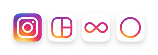
Instagram also implemented the new gradient to their other flagship apps, which include Layout, Boomerang, and Hyperlapse. Another noticeable difference is Boomerang’s logo redesign, which was updated from a caret-shaped boomerang (its namesake) to an infinity sign in order to indicate the infinite loop videos produced by the app.
The new simpler black and white interface puts more emphasis on content. Much of the white space surrounding photos in the app has been eliminated, providing wider-framed photos for a more immersive experience.
As with most changes, the Internet erupted with protests and whining about the update with a general dislike for the new icon. Complaints ranged from the new gradient design to the oversimplification of the camera icon.
How the new Instagram icon was made. pic.twitter.com/GnivZv81pW
— Oliur (@UltraLinx) May 11, 2016
With the evolution of photography and technology as a whole, there is no single medium in which we create content. The redesign of the camera icon is a manifestation of the creative community and where content comes from, whether it’s ye olde polaroid camera, a GoPro, or a simple smartphone camera. The new camera icon leaves interpretation up to your imagination, while the most memorable parts of the logo—the camera lens, the rounded icon shape, and the viewfinder—remain unchanged. (FastCoDesign).
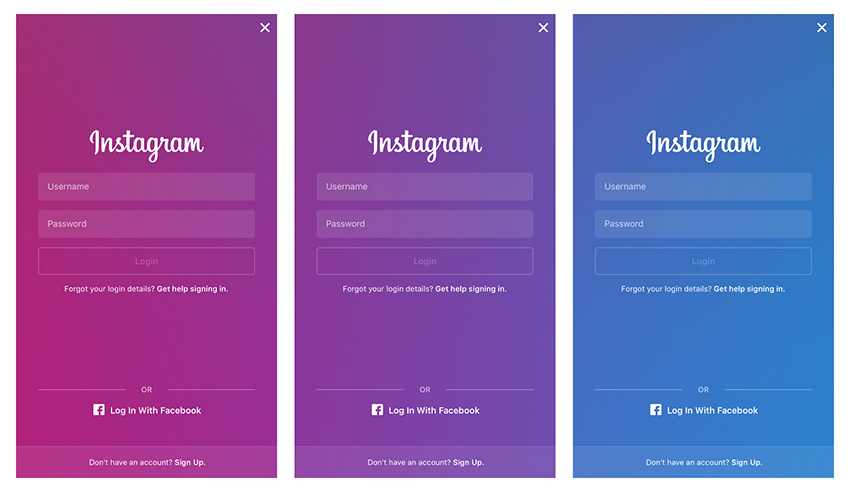
We could even argue that Instagram was hinting at the gradient when they rolled out the new login pages. If you keep an eye on the login screen, you see that the magenta gradually goes from purple and then stays locked in on the app’s original blue shade that we came to know and love.
While I do share the sentiments of the color gradient being a little aggressive on the eyes and my home screen, such a widespread change evokes a new chapter in Instagram’s story and how far the app has come from its humble beginnings. I’m constantly reminded of how the app used to look on my old iPhone 4 (thanks, Timehop) and welcome the changes with open arms.
What’s your take on the redesign?